Archive for the 'Innovation' Category

CVS and Ford: Putting Designers in Customers’ Shoes – literally

Point: To design better for customers, put yourself in their shoes.

Story:  What’s it like to drive a car if you can’t turn you head easily to look over your shoulder? Or to shop, if bending over hurts and the product you want is on the bottom shelf?

That’s what older drivers feel, and every minute in the US, one person turns 66. In seven years, the US will have 55 million people over age 65 — a big market.

To better design for the needs of this market, companies like pharmacy chain CVS are putting themselves in the shoes of aging customers with AGNES. AGNES stands for “Age Gain Now Empathy System.” Developed by the MIT AgeLab, AGNES is a specially-designed jumpsuit that mimics what it feels like to be in your mid-70s. The suit can be be worn by designers, product developers, architects and planners to experience firsthand the physical challenges associated with aging. For example, bungee cords anchored to the helmet and hip restrict movement and rotation of the spine, and elastic bands from hit to wrist reduce shoulder mobility.

CVS will be making store design changes based on learnings from the suit. For example, they’ll be putting carpeting in the stores to reduce slick-floor slipping, and they’ll adjust the height of checkout counters to require less bending and lifting.

Similarly, Ford Motor’s engineers use a similar suit (they call it the “Third Age Suit”) to experience driving with restricted movement and dexterity in hands, knees, neck and even eyesight (goggles simulate cataracts).  Ford also has a bulbous weighted “empathy belt” that simulates the physical effects of pregnancy.  All of these inventions help give designers a better sense of the consumer’s experience of the company’s products and services.

The result: not only will product designers develop better products for the elderly, but their innovations — like Ford’s hands-free automatic parallel-parking system — appeal to consumers of all ages. Simplicity, ease and comfort attract customers of any age.

Action:

  • Create tools or prostheses that simulate the customer’s experience of the product or service
  • Test products and services for ergonomics for a wide range of customers (especially the growing population of those over 65)
  • Look for win-win design solutions that improve usability for everyone.


Sources:

MIT AgeLab: AGNES (Age Gain Now Empathy System)http://agelab.mit.edu/agnes-age-gain-now-empathy-system

Future Demographics – The Silver Book: http://www.silverbook.org/browse.php?id=57

Interview with Dr. Joseph Coughlin on AGNES and the AgeLab: http://web.mit.edu/newsoffice/2009/coughlinqaa-0414.html

In An Aging Nation, Making Stores Senior-Friendly
http://www.npr.org/2011/05/10/135773106/in-an-aging-nation-making-stores-senior-friendly

In a Graying Population, Business Opportunity
http://www.nytimes.com/2011/02/06/business/06aging.html?pagewanted=all&_r=0
A Profile of Older Americans: 2011 – Administration on Aginghttp://www.aoa.gov/aoaroot/aging_statistics/Profile/2011/docs/2011profile.pdf

Comments Off on CVS and Ford: Putting Designers in Customers’ Shoes – literallyCase study, Customers, How-to, Innovation, New Product Development
Innovating with Osterwalder’s Business Model Canvas #BIF8

Point: Create new business models using a visual, collaborative tool like Alex Osterwalder’s Business Model Canvas.
Story:  Business models are complex, which makes them hard to talk about. A business has many interrelated moving pieces.  It’s easy for you and your team to miss something when creating one. And with so much complexity and so many possibilities, it’s easy misunderstand each other when we try to invent new business models.
Luckily, there’s a solution. Alex Osterwalder’s Business Model Canvas is a visual tool that helps structure our thinking about business models.

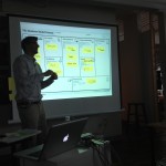
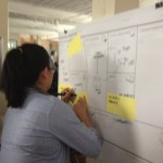
At Osterwalder’s Business Model workshop at BIF8 last week, I saw the power of his Business Model Canvas firsthand.  Osterwalder outlined the Canvas method and gave the group the assignment to generate a business model for a specific startup.  Small groups clustered around their canvas and the room buzzed with discussion and the squeak of markers as participants took turns sketching out ideas.  As we worked, I was struck by three key features of Osterwalder’s approach.

The first key feature was that Osterwalder encouraged sketching, not just making lists of words. “Any problem can be made clearer with a picture,” he said. The visual artifact lets people react to something concrete.  To encourage people who think they can’t draw, Osterwalder pointed out that people can interpret a stick figure more easily than an abstract concept. “Drawing something, however badly, makes an abstract concept concrete, giving people an opportunity to react to it,” Osterwalder said. Visual thinking helps with understanding, dialogue, exploration and communication.

The second key feature was that Alex had us make our sketches and notes on Post-It® notes.  We then stuck these to the Canvas.  The key part was that then we could move the notes around as we figured out where on the canvas they belonged. “Post-It® notes are like containers of ideas,” Osterwalder said, that can be easily picked up and moved around.  Thus, we could reconfigure our ideas as we refined them.

The third key feature was that the Canvas with its Post-It® notes ensures you don’t miss an important area. Because business models are so complex, with many interlocking pieces, it’s hard to hold all the pieces in memory and see their interactions and dependencies. The Canvas helps everyone see all the pieces and confirm that they work together and make sense. People can use different colors of Post-It notes for different business models, which lets them compare alternate models on the same Canvas. This side-by-side comparison can help to then pick the most promising model to test.

Action:

  • If you’re working in a group, print the Canvas in large format (we used 3′ x 4′ at the workshop).
  • Most people start on the righthand side of the Canvas, which is the customer side of your business model. It has the “Customer Segments,” “Channels,” and “Customer Relationships” areas. The lefthand side defines the infrastructure of the business with “Key Activities,” “Key Resources,” and “Partner Networks.” A central “Value Proposition” sits between the infrastructure areas that deliver on the proposition and the customer areas that receive the value. Finally, the “Cost Structure” and “Revenue Streams” areas on the bottom sit respectively under the infrastructure and customer sides of the canvas to define the financial side of the model.
  • Play with different kinds of models. For example, Nestlé (in its Nespresso business) tested a model in which Nestlé sold its espresso machine through retail but sold the individual “pods” of coffee directly to consumers. Going direct was new to Nestlé but proved to be very lucrative because Nestle didn’t have to share revenue with the retailer.
  • Keep interdependencies in mind. Every revenue stream, for example, must have a customer segment with an accompanying value proposition that makes it clear why they would pay.  And every activity, resource, or partner might incur costs.

Sources:
Alex Osterwalder’s bestselling Business Model Generation book is a must!

Alex Osterwalder’s Business Model workshop at BIF8.  See his calendar of upcoming speeches and workshops.
Alex Osterwalder’s slides on SlideShare, such as

2 Comments »How-to, Innovation, Software tool, Strategy

Visualizing Insights

Point: Use visual representations to spur innovative thinking.

Story: Scientific visualization is typically used to communicate data and scientific results, but it can also spark ideas.

Felice Frankel is a scientific photographer who works with scientists across many disciplines — chemistry, biology, oceanography, and so forth. As she sees it, the various disciplines share similar ways to represent data. But, “Unfortunately, you rarely see scientists from different disciplines talking with each other,” she says.

Images can jumpstart communication by creating a common language among different disciplines. What’s more, images can spark new ideas, even if those images are of data which you yourself have been working with for years. Seeing your data presented in a new way can yield new insights. The new depiction gives you a new perspective.

For example, in one project, Frankel was exploring how to show glowing nano-crystals suspended in liquid. She zeroed in on an abstraction that cropped the top and bottom off each glass cuvette of the nano-crystals. The resulting image removed all visual references to the nano-crystals’ containers. After seeing Frankel’s photograph, Moungi Bawendi, an MIT scientist who’d been working with nano-crystals for years, thought of a potentially new application for them because the new image reminded him of a colored bar code. Bar codes are used as a form of labeling. Seeing the nano-crystals arranged like a bar code gave Bawendi the idea to use them as an alternative to fluorescent organic dyes that scientists currently use for labeling, imaging, and monitoring biological systems, particularly in their response to cancer.

In addition, the visual language of pictures and graphics breaks down the barriers of jargon, discipline-related terminology, and language, making it possible for non-experts or non-native speakers to provide input and collaborate. The visual language “allows us to talk to each other about an image, point out parts that are interesting or beautiful, and ask questions without hesitation,” Frankel says.

Similarly, for David Macaulay, drawing is his way to figure things out, to question, clarify and think about things.  Macaulay, bestselling author and illustrator of The Way Things Work and 24 other highly-illustrated books, says: “When you draw something, you really have to look at it. And when you really look at it, you can’t avoid thinking about it.”

Macaulay’s books are primarily images, interspersed with words. “How great is it to have those two languages to work with and pick and choose from?” Macaulay says.

I’m looking forward to meeting Macaulay and Frankel at the Business Innovation Factory’s annual summit on Sept. 19-20, 2012. The summit is almost sold out (it sells out every year), but a few seats remain available as of this posting.

Action

  • Look at images from different disciplines to see new ways to present your data or visualize the problems and solutions that you work on.
  • Create images with different arrangements, even abstractions, of your data or system to reveal new patterns in your data or ideas.
  • Ask people what they see in your images, whether it’s patterns, beauty, or metaphors that can spark new ideas about your area of work.

Sources:

Felice Frankel’s new website: http://visual-strategies.org

Felice Frankel and Angela H. DePace, Visual Strategies, Yale University Press, 2012

Deborah Halber, “Smarter Quantum Dots,MIT Spectrum, Fall 2011.

Tim McIntire, Felice Frankel: Scientific Discovery Through Visualization

Frankel, Felice. “The Power of the ‘Pretty Picture,’” Nature Materials.

http://www.felicefrankel.com/

Comments Off on Visualizing InsightsCreativity, How-to, Innovation

« Prev - Next »